Alone, Together: Political principal in the 1975 and 2016 referendum campaigns
- Ellis Pearce

- Jan 31, 2021
- 13 min read
Britain has taken it’s relationship with Europe to a vote in both 1975 and 2016, with a lot of continuity between the economic and political advantages highlighted by the campaigns on either side of the debate yet the framing of these arguments varied greatly between 1975 and 2016. Comparing the campaign material between the two referendums provides insight into the sense of national identity, individualism and democratic freedom that surrounded the issues at hand. While any given person likely seeks to be as informed as they consider responsible when it comes to matters of democratic engagement, we are often swayed more strongly by an appeal to principal, and the arguments for or against the EU in particular depended heavily on the conviction that support for one side or the other was rooted in political principal. Successful political campaigning requires motivating the audience into a desired action or engagement, and to do so it’s often necessary to increase the emotional tension of a debate. The role of graphic design within this is to put any given message within a context that allows the audience to understand the breadth of the issue as quickly as possible while motivating them to act on this context.


Backing the EEC, Students for United Europe played on the language of the referendum leading with a bold “YES!”, with a few notable design choices showcasing the style of the era and the visual shorthand employed to frame the conversation within the context of the referendum. The map like illustration of Europe and Britain works effectively as a visual representation for the issue at hand - Britain’s place in Europe - and was commonplace among campaign materials in 1975 on either side of the debate, with different elements highlighted or caricatures made in order to emphasize various points of view. In the case of the leaflet produced by the Students for United Europe the illustration focuses on turning the metaphorical “Build bridges … not barriers” slogan into a literal image of the UK connected to mainland Europe by a bridge, this visual representation is by no means subtle but it does the job, the text is bold and the arguments made by the organisation are summarised effectively while being visually supported. The stance is clear as is the role of the voter, with the language “build bridges” placing the voter in an active role; you are choosing to act on the relationship and play your part on the democratic stage. Notably this material plays on the red, white and blue colour that is employed by both sides of the debate, often as an allusion to national unity and independent sovereignty. The same colour scheme is employed by other pro-EEC campaigners Britain in Europe and the Conservative candidate for Liverpool, Gloria Hooper likely as a means of playing on the conservative sympathy for nationalism in order to position Britain's place in Europe as a patriotic duty.


The imagery employed by Plaid Cymru in opposition to the common market is very similar to that of the pro-EEC stance taken by Fianna Fáil which employ the map imagery as a means of visually isolating the nations, while these both adopt similar styles and visual approaches the intended outcomes are entirely contradictory. Fianna Fáil poses the audience with a question “Is this the kind of Ireland you want?” doing so invites a level of agency on behalf of the audience, which contrasts with the emotive but restrictive “In memory of Wales - to be killed by the common market”. Its clear that nationalistic sentiment plays an important role in this conversation, with the nations at the heart of the material, and yet the imagery used can be employed at both an advantage or disadvantage to the campaign depending on the emotions it evokes. The appeal of nationalism is rooted in the sense of strength and unity it evokes, by visually isolating, and linguistically placing Wales in a passive role Plaid Cymru fail to evoke this emotional strength. While Fianna Fáil faces similar shortcomings, at the very least, fears of external threat are used to place the audience in an active role.


The policy leaflet published by the AUEW (Amalgamated Union of Engineering Workers) and the Independent News leaflet published by Get Britain Out share similar stylistic directions that punctuate the tone of both. The style is somewhat dictated by the form with both going for a tabloid format which relies on dense text and the leaflets are predominantly black with red accents - the impact is bold, and supports the bluntness of the approach while the colour scheme underscores the warning nature of the documents that decry the EEC and the common market. The AUEW front page with the strong “No” followed by a list of “No to... “ statements perhaps exemplifies where the language of the ballot box can become a hindrance to the campaign. While the use of the specific language that will be used when voting can clarify the position of voters and streamline the process, the emphasis on “NO” as we see it with the AUEW requires an emphasis on the negative actions of staying aligned to the EEC rather than the positive outcomes of breaking from the EEC. The AEUW policy leaflet and the paper from Get Britain Out are both punctuated with the fears of staying in the common market, the Independent News leads with a distinct “Warning” against the EEC, while the AEUW leads with “No to high food prices, no to unemployment, No to damage to trade, No to the destruction of democracy” this language plays up a sense of fear while neglecting to embolden the reader with any sense of agency that might promote action. While both materials explore the topics fairly in depth, by focusing so strongly on the negative the need to explain or seek out a greater understanding of the position presented is defeated by the sense of urgency implied by the blunt visuals. The Independent News focuses on a section that highlights the position of Labour MP Tony Benn, “Tony Benn explains how common market hits democracy” this link between individual political figures and their position on the referendum plays a much larger role in the materials produced in 2016 with Benn.


In comparison the Vote No leaflet produced by the National Referendum Campaign distills the same arguments in a way that cuts to the chase without playing up the sense of fear, the slogan “vote no to secure our future” introduces a greater sense of hope and agency. Rather than prefacing the breakdown of issues with inflammatory statements the flyer leads with questions “concerned about your food?” “Concerned about your jobs?” Again the use of questions assumes a greater level of political literacy on behalf of the voter and treats their concerns as legitimate and engages with them maturely. By respecting the audience's ability to understand their own concerns the material respects the voter themselves and likely making them more sympathetic to the position presented. However this is undermined by the forcefulness of the “NO” that leads the visual statement. This flyer also begins to employ the red white and blue colour scheme but with greater emphasis on the red, introducing continuity with “vote no” materials such as the AUEW while drawing on national sentiments.


Fears surrounding the political control of Europe over Britain were not new to the 2016 referendum. The “Brussels - the new capital of Britain?” flyer distributed by the London Co-op focuses on the same talking points that became the center of conversations surrounding national identity and self determination in 2016. Yet the visual language surrounding the issue in the 1975 doesn’t relate the issue back to national identity or a sense of self determination. Focusing again on the image of a map the flyer characterizes Britain as running away from Brussels, like Plaid Cymru’s “in memory of Wales” the focus here is to draw on the fears of external threat to national identity and sovereignty, but in painting that national identity as weak the impact is likely to dismiss the sense of threat in order to maintain the mythos of national power . While phrased as a question, which when used elsewhere has put upon the audience a sense of agency, here the rhetorical nature of the question only results in muddying the stance of the material. While “Let’s get Britain out of the common market” has a greater sense of agency than the bold “No” that dominates the leave campaign as it leads with an active proposition that unites Britain with itself under the action rather than with Europe under the common market, it’s underscored by the tone of the imagery and the image of Britain that has been presented.


Although Nationalism played a key role in the principals behind a lot of campaign material, as we have seen, it was not the only motivating actor at play. The Liberal European campaign focused on portraying a united Europe as the summation of Liberal principal. In the same way the arguments we see for the EEC made by Hooper and others tie their arguments to nationalistic principal, the Liberal party ties their arguments to liberal principal, the assumption being that the audience they are appealing to believe in a Liberal future, meaning the arguments are not necessarily for the EEC itself, but justifying the role the EEC plays in this future. Again the map is utilised as a form of shorthand for the topic with it being used on both the "A United Europe: the Liberal vision" flyer and "Don’t slam the door on Europe" poster. The intention is to appeal to a specific set of values and position those values as being integral to the EEC. The focus here is of-course on the liberal position, which is supported by reinforcing the global role of both Britain and Europe, while associating the issue with the family.


The 2016 referendum brought a heightened emotional dimension to the debate surrounding the EU, without specific terms of withdrawal or trade agreements to determine what the impact of Brexit might be on Britain the arguments to leave had to rely more greatly on moral incentives and push the emotional stakes. A sense of national identity and agency took on a more explicit role in the conversation with campaigns such as Better Off Out asking "Are you British... or European?". The advantages or disadvantages to trade, the status of laws and the various details of what membership actually means are entirely forgotten. In celebrating British cities, landscapes, culture and history the question is redefined as a show of patriotism, the reality of the EU is unimportant to the question "Are you British? Or European?".
Visually, materials produced by Better Off Out showcase a few key design trends of the 2016 campaigns. In comparison to 1975 there is a much greater reliance on photography, while 1975 saw a few key visual representations repeated but altered slightly to support the point of view, the wider use of photography in 2016 resulted in a much greater range of imagery used, with Better Off Out employing everything from British landmarks, to stock images of food and crowds. While the images do relate to the topics at hand they rarely add anything of particular value to the statement, the breadth of imagery results in a much shallower use of visual material and where it is employed it is often to fill space and break up dense text. Better Off Out also adopted the blue and yellow colour scheme of the EU, and a logo which plays on the flag of Europe. Although the direct appeals to the audience do not appear to directly reference the EU "Are you British... or European" "Is Britain getting too crowded?" and "You are paying too much for your weekly shop." the visual choices that allude to the EU position these questions within the context at hand without having to say it, allowing for the text itself to be punchier and focus on direct appeals to emotion.


The dependence on photography for 2016 materials, while allowing for a great range of visual ques resulted in often vaguely related images that are relevant to the topic but don't contribute much beyond the space they take up. For example the cover of a leaflet produced by Best for our Future focuses on a photo of a woman with two young children and while this relates generally to the sense of "future" and can introduce the emotional stakes of family from this image alone it would be impossible to divine what impact Britain's relationship with Europe would or could have on any given family unit or the future of British children. In comparison a German poster from 1975 depicts the 9 member states as children with the slogan “They expect their future from Europe”, the intended emotional response is the same between the two materials with a focus on the future and the impact on the family but in the German poster the images serve to humanise the process of democracy while reinforcing the relationship between the referendum and the impact on children.


A key example of the high emotional stakes of the 2016 campaigns is an anonymous flyer declaring “notice to all immigrants: regarding the vote leave campaign. The word “Leave” is directed at you.” The intention of this poster is to counter racist and xenophobic sentiment, with the reverse side declaring “fight racism! Fight Nationalism! Support workers. Support refugees. Support Families. No to BREXIT! No to UKIP! Borders kill”. While the aim of this flyer is likely to take the sentiment of the opposing campaign and highlight the negative repercussions, the reality is that at first glance this flyer could just as easily be taken as anti-immigration. The language is inflammatory and accusatory without supporting the intended message with any legitimate sense of solidarity, nor does it illustrate the arguments that lead to its conclusion surrounding the nature of the Leave campaign resulting in a piece of campaign material that creates high emotional stakes with no specific actionable requests that impart a sense of responsibility or agency on the viewer. While the emphasis on ‘fighting’ racism and nationalism suggests that racism and nationalism are tied, a sympathetic audience would understand these issues to be complex and not necessarily know where to begin on "fighting" the hostile elements of nationalism, while an antagonistic audience has been offered nothing that dissuades or tempers that antagonism. In the end the result is an emotive but confused statement. Perhaps the intention is to illustrate the nature of the Leave campaign and rob it of its power but the reality is that publicly highlighting anti immigration sentiment in this manner is only likely to embolden that very sentiment while cultivating apathy toward the issue on behalf of euro-skeptics who have doubts outside of immigration.


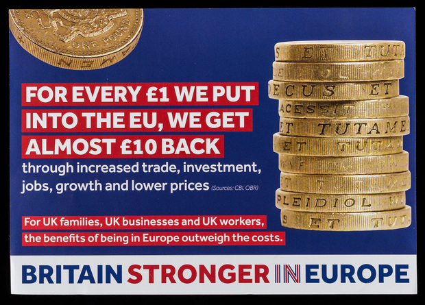
2016 saw a greater reliance on sums and figures, this is in contrast to painting the referendum as a matter of principal and serves to introduce financial stakes while rooting the advocated view point in a sense of legitimacy. Two leaflets from Better Off Out and Britain Stronger In Europe adopt almost identical visual representations of the figures discussed using photos of stacked pound coins, the key differences lie in the text with Better Off Out opting for the speculative "Your household could be £933 per year better off if the UK left the European Union" with Britain Stronger In Europe adopting a greater sense of legitimacy with the moderate, and sourced "For every £1 we put into the EU, we get almost £10 back". At first glance the Better Off Out poster suggests a greater financial incentive to leave, offering, quite literally, taller stacks of money than remain, at the same time the speculative nature of "Your household could..." is more likely to incite action than the matter of fact tone employed by Britain Stronger in Europe, with the emphasis put on the individual household rather than an undefined "We". While it's likely Britain Stronger in Europe were likely attempting to appeal to a sense of national identity with the red white and blue colour scheme and emphasis on Britain in their own name - which would support the use of "We"- the general tone is too passive to capture the spirit of patriotism that makes theses appeals successful. The speculative nature of the wording employed by Better Off Out also brings into question the legitimacy of the statement, its a vague, ill defined promise similar to the misleading nature of the slogan at the bottom "Free trade - YES! Political Union - NO!" that implies a greater sense of control or agency in picking and choosing the terms of withdrawal than was the reality. The pure volume of material produced by Better Off Out which spans different arguments and incentives is also interesting and suggests a wider campaign strategy that was itself motivated by principal, adopting any argument it could to justify this principal.


These campaigns are operating on a sense of principal but are relying on figures for a sense of legitimacy, they lead by the principal and then shape the numbers around it resulting in misleading applications of figures such as the "Let's give our NHS the £350 million the EU takes every week". Statements like this appear as direct and appealing promises and yet they obscure the reality of the situation, upping the emotional stakes while misleading the audience. Whether or not Britain would be better off out of the European Union or not, Leave campaigners relied on misleading material to make it happen.


The personal element is another factor in the 2016 referendum that acts to prop up the sense of principal that drove campaigns. The value here is putting a recognizable face that the audience likely trusts and respects behind the politics, however it also takes the gamble of tying the campaign to those individuals. Green Leaves produced a series flyers that broke down individual perspectives, declaring "I'm with..." allowing the audience the opportunity to align themselves with the reason of an individual above a sense of principal, even if they are only sympathetic to those individuals because of the principals they embody. While we are likely to be sympathetic to the views of people we respect and trust this strategy runs the risk of alienating the audience who aren't familiar with the individuals at hand. In comparison Britain Stronger In Europe condensed their collection of "experts" into a single leaflet, asking "Not sure who to believe on Europe? Find out what trusted experts say", the approach here relies on the chosen individuals to be trusted by the audience and reasonably considered "experts" on the topic, an approach undermined by lumping political figures, scientists, business moguls and popular figures under the same banner of "expert" irregardless of their actual expertise, the suggestion being fame itself makes someones opinion on the matter more legitimate than the layman. The result is patronising and diminishes the value of the opinions of those who might genuinely be considered experts when they are lumped in with those whose opinion is only relevant because of their personal wealth and celebrity status.


Throughout the campaigns we can see the value that positioning the audience or voter as an active player, with agency has in a successful campaign. In 1975 the language around voting ‘No’ focused on voting to not take part in the free market, while in 2016 this same issue was re-framed as a vote for independence, you were no longer voting against the common market you were voting for British independence. These principals were supported by a visual language that turned the complex relationships of national identity and global politics into a short-hand that could be digested by the audience while relying on specific era relevant design trends. It's important that political campaigns treat their audience with respect and value the judgement of the people they are appealing to, while instilling a sense of responsibility and agency over the issue at hand.
Images sourced from https://digital.library.lse.ac.uk/collections/brexit


Comments